In the end…

As I look back at my journey through Context and Narrative, I feel the course has pushed me in directions I was not expecting, and what I have taken out of it is not so much connected with the outcome of the assignments and exercises, but more with the process used to create them and how this would shape my future work.

In terms of the outcome, the photographs I have produced for this course all have a lot in common. I have featured as a model for all assignments (other than 4, which was a written essay), and props were used extensively in assignments 1 to 3. All the photographs were also taken in set-up, controlled conditions. Before this course, I have rarely done any of this in my practice; so it was a new experience, but somehow I never felt that it was a finished one. I believe all these images to be not so much as work in progress, but a springboard to new ideas that will undoubtedly derive from the junction of this new way of working, and my traditional practice which has very much focused on found objects and situations until now.

While the pictures bear aesthetic similarities, they way I got there has been different in all assignments and this for me has been the aspect of Context and Narrative that I have enjoyed the most. Assignments 2 and 3 involved a greater degree of self-reflection and forced me to develop ideas in an abstract, non-visual context at first, whereas for assignment 5 I decided to create images inspired by fictional short stories I wrote at that time. How these ideas were translated into the visual realm has not been an easy process for me, to a great extent because I am more used to work in reverse (ie I am more used to translating found visual elements into a narrative), and while I feel that I am more satisfied with the way the reworked version of these assignments turned out, I believe this is an area where I would need to invest more time in the future.

I enjoyed assignment 4 in particular because it compelled me to look into photographs with a level of detail I have not done before, both visually and contextually. Looking into the work of Andreas Gursky for that assignment, as well as other exercises and research points elsewhere in the course, pushed me to explore alternative photographic techniques including digital manipulation.

Another aspect of the course that I found interesting is the amount of research we are encouraged to undertake. This is useful because it pushes us to acquire a good idea of current photographic practices and trends, but at the same time is limiting because the primarily focus is on photography. One piece of advice from my tutor which I would like to practice more going forward is to look and experience other art forms more, including non-visual ones, for inspiration and enjoyment.

Links to all formal printed submissions

For ease of reference, I have included below links to electronic versions of written notes accompanying the photographs submitted for assessment.

Notes

Self-Assessment

Essay / Captions / Other

Assignment 1 assignment 1 notes – final (for blog) assignment 1 – self assessment – final (blog)

N/A

Assignment 2 assignment 2 notes (redone – for blog) assignment 2 – self assessment – final (blog)

N/A

Assignment 3 assignment 3 notes (final – blog) assignment 3 – self assessment – final (blog)

captions

Assignment 4 N/A assignment 4 – self assessment – final (blog)

essay – remastered (blog)

Assignment 5 assignment 5 – perception (final – for blog) assignment 5 – self assessment – final (blog) the breakdown (short story 1 – final for blog))

the break-in (short story 2 – final for blog)

Assignment 5 reconsidered

Following feedback from my tutor (his comments can be seen here), I decided to re-work the image I created for assignment 5 (see below).

assignment 5 final
Figure 1 – Image submitted to my tutor for this assignment

Upon reflection, there were various fundamental problems with the image I submitted to my tutor. One was my choice of lens. I opted for an extreme wide-angle because I wanted to include more context inside the car, but the result was that the person peering through the window was rendered too small. In the revised shots, I returned to a more moderate 30mm lens which, while still being wide-angle, allowed for a slight compression of the two picture planes (the car and the house behind). The other significant problem with the images, which my tutor emphasised in his report, was the lack of connection, let alone tension, between the two characters portrayed, part of which comes from one of them being rendered too small, but more fundamentally, because there is too much passivity in the shot. My initial idea was that the character in the car looks concerned at somebody in a distance, somebody that could potentially be a threat. But my fundamental problem is that at this stage the threat is too hypothetical and he does not look that concerned as a result. Meanwhile, the character by the window behind should look concerned but is rendered too small for this to be noticed. I looked again at the short stories I developed for this assignment (revised versions can be found here and here), and decided that I wanted to experiment with what would happen when the threat faced by the man inside the car became more eminent. This led me to add a third character into the image, that of the hooded man at the distance in the first short story.

——————————————– ooo ——————————————–

Using the same illumination ideas developed for the first attempt (see my notes here), I took an additional set of pictures where I tried to play with the idea of adding the hooded man in various poses outside the car, seemingly interacting with the man inside or just passing by rapidly. The character inside the car, likewise, is played with different expressions in reaction to what is happening just outside. The character peering through the window upstairs, which is now slightly more prominent thanks to the use of a narrower wide-angle lens, was directed to look surprised at the events unfolding in front of her property. Her expression and face was rendered with more clarity on this occasion. The images were combined in post-processing and converted into black and white, unlike the originally submitted colour picture, because the unbalance of colour casts was too great between the different parts of the image and this was becoming too distracting. Some of the sequences developed from these images are shown below, while annotated contact sheets can be seen here.

_1030754
Figure 2 – Image composed of the car character looking lost in his mind, prior to being approached by the hooded man. This is a preface shot, before any of the other characters in the story make an appearance
_1030755_4
Figure 3 – In this image, the hooded man character is about to leave the frame, possibly after having interacted with the man in the car, who follows him with his eyes. There are no hints at what happened before the image was taken, but given the concerned expression of the girl peering through the window in the background, we could assume that the interaction was not amicable.

From the sequences developed, I have chosen the image in which the three characters “converge” with their glance, which I believe is closer to my original intention of developing something to explore personal perceptions of trespass and our prejudices when dealing with strangers.


_1030755
Figure 4 – Final image selected for submission

The revised notes for the assignment can be found here. A revised self-assessment can be found here.


Assignment 4 reconsidered

Following feedback from my tutor (you can find a copy of the report here, with annotated commentary on the essay here), I made some changes to the essay with the aim to improve drafting in some areas and to make the intention of my comments clearer based on the mark up provided by my tutor. The final version of the essay can be found here. A revised self-assessment for this assignment can be seen here.

Assignment 3 reconsidered

Following feedback comments received from my tutor (see attached here), I decided to re-work my submission for the third assignment.

A key comment from my tutor was that the images presented were at times too literal transcriptions of the captions. His advice ranged from changing the caption or reworking the images, to eliminating the caption altogether in some cases. I felt that captions were a key part of the work and that I did not want to remove them. However, when looking again at the work as originally presented, I noticed two things: that indeed the pictures were sometimes too close to some of the words, and secondly (and perhaps more importantly) that the captions did not reflect the story I wanted to tell. The latter was perhaps a consequence of following the script of the assignment too closely: I had given my diary to somebody to select the best parts on my behalf and I worked on finding images to suit such passages, but when I read the diary myself for a second time, for the purposes of this reassessment, a different story emerged, underlined by the state of mind I was going through at that time. I felt compelled, when I re-read these diary entries, to develop that story further by re-selecting all the captions and trying to fit them to the images I had taken at that time, including some which were initially rejected. When doing this, I wanted to put a degree of separation between the images and the captions, so that the former were not seen as a literal representation of the latter. I went about this in two ways: at first, I tried to recall what was happening when I took the pictures (and not necessarily what the pictures show), and then match such feelings to the new captions. When this did not work, I focused on the feelings that the pictures evoked when looking at them now.

The final image selection is included below. The revised annotated contact sheets and assignment notes can be found here and here

dsc02454dscf2479dscf2529dsc02572dscf2691dscf2421dscf2707OLYMPUS DIGITAL CAMERA

As was the case in my original submission, I intended this work to be presented as a booklet, alongside the captions, of which a mock-up can be seen here. A revised self assessment for the assignment can be found here


Assignment 2 reconsidered

Following comments from my tutor on assignment 2 (see report here), I have decided to revise my submission for this assignment.

There are two issues with this assignment that I have noted after reading the feedback from my tutor. One is the lack of a defined narrative, a story that connects with the idea I wanted to portray. My tutor mentions in his report the work of Duane Michals, which I have referenced for this assignment, as an example of photographic series that constitute self-contained stories; and it is from a particular work of Michals (Things are Queer, link to my comments here) that I have taken inspiration to re-work the assignment for my final submission.

The lack of clear narrative in the first draft is a consequence of how the work developed. Initially, it was my intention to create individual vignettes all related to the idea of the passage of time in the context of technological advances, and how nostalgia for the past plays a role in our relationship with new technologies. As the individual images were put together, the series evolved into a loosely connected story about relationships being rekindled. However, the connection was not particularly strong and this is something that my tutor also mentioned in his report. I have reflected upon the initial series, the theme behind it, and other comments made by my tutor in his report (around my lack of exploration on the consequences of new technology) and repositioned the series into something slightly different. The final submission series is still about rekindled relationships in the context of our (sometimes difficult) transition from old to new technology (that facilitates this, to an extent), but I have tried to strengthen the narrative and move it towards the disappointment that may come after remembering why long-lost links were broken in the first place. Finding out about old acquaintances in social media is something that feeds into that nostalgia for the old times (represented here by old technology), but in many cases (at least in my direct experience) those reestablished connections do not lead to renewed friendship in the real world. As a consequence, we continue to be as lonely as before, even though our virtual self may be awash with likes, retweets or followers.

As a result of these changes in focus, all pictures were re-taken for the re-submission. I have removed some images that were not contributing to the revised narrative, particularly ones that I considered to be slightly gimmicky, and have re-shot the rest, including new ones, while re-approaching the underlying theme of the struggle between old and new tech in a more subtle way. The connection with Things are Queer comes from my new first and final images for the series, which have been taken in the same location, with the same props and lighting conditions, but that are to be interpreted quite differently, and provide both genesis and closure for the story.

I have also removed the presentation PDF booklet (see original here) from my final submission because I did not feel it was adding anything to the process in the end. As long as individual prints are viewed in the correct sequence (as shown below), I believe no additional presentation aids are needed to convey what I wanted to say.

The finally selected images are shown below. Revised notes and annotated contact sheets can be found here and here respectively. A revised self-assessment can be found here

dscf9638dscf9654_dsf5049_dsf5007dscf9627dscf3298dscf9631


Assignment 1 reconsidered

Following feedback from my tutor (see here), I decided to have a second look at the series presented for this assignment and rework some of the shots. My initial idea was to present two set of pictures that were all staged, caricatured versions of life, portraying seemingly opposed attitudes to it. A key comment from my tutor is that the pictures look too staged, and I agree that in the second set, some of the pictures look far too clean for what I wanted to convey. To an extent, this is a limitation of the way I have approached this work, that is to portray imagined situations related to certain activities (eg eating, relaxing, working), as undertaken by each of the two characters. As these activities were pre-conceived to match across both sets, it is possible that some of the resulting pictures were more forced, less spontaneous than others. Having said that, I agree with my tutor’s implied comment that less spontaneity and more detachment in the first set (ie the “city director”) were perhaps desirable to emphasize the stiffness of this character. I have tried to re-work some of the shots for the second set, the “photographer”, to make them less clean and slightly more allegorical. The changes have not been dramatic, though, because I did not want to lose sight of idea of a continuum between the two sets, a sort of dual life within the same person, which is the central theme of my work here: that both sets looked “too clean” in the first place may have been an unconscious consequence of my decision to assume that both characters were essentially the same person.

In addition to re-shoting some of the pictures for the second set, I have re-drafted part of my assignment notes to clarify my intention, following comments from my tutor. The two sets are meant to show two different personas, but not necessarily two different persons. Key to this idea is the way I have chosen to present the work, as a continuum between the two sets, as if one character would take over from the other at a certain time of the day. Setting aside the fact that both are played by the same person, are the attitudes and activities of these characters sufficiently apart so as to create the impression they may not be the same person? Or are there clues to the contrary? I have tried to steer the work towards that ambiguity and I hope that my final submission works better in that respect.

The final submission of pictures is shown below, together with revised assignment notes and PDF booklet (1) showing how I envisaged the work being presented. You can also find revised contact sheets here, and my revised self-assessment here.

069a0122069a0249069a0273069a0362069a0217069a0350069a0341dscf3313dscf9589dscf3283-edit069a0330dsc01241

______________________________

(1) For correct viewing, select “two page view” in your preferred PDF reader.

Archive research – Some preliminary ideas

I have identified some archives and organisations collecting photographs that can be interesting to explore in the future for work ideas:

The V&A Prints & Drawings Study Rooms (South Kensington, London): This houses an important collection of 19th and 20th century photographs amassed by the museum over decades (the V&A has been actively collecting photographs for over 100 years), which was recently enlarged by the transfer of the RPS collection from the Science Museum. The original photographs, including those made directly on glass plates, can be accessed by the public under certain circumstances and are grouped in boxes, with some of them contain work by unknown photographers, so this could be an interesting way of discovering new artists and ideas that could perhaps depart from the mainstream.

The National Archives (Kew, London): The archives have various materials and documents as well as photographs that could be accessed by the general public for viewing. Some of the photographs can be searched online, but viewing / downloading incurs a cost, so it may be better to view them directly in the archives’ reading rooms. The selection of photographs do not seems as extensive as in the V&A, but the combination of photographs and documents could provide interesting ideas to explore.

The British Library (St Pancras, London): The library holds an important collection of photographs, including the archives of Fox Talbot, one of the medium pioneers. Like the V&A, this is another good way of getting to know early era photographers, but obtaining a reader ticket seems to be more complicated than in the case of the V&A, so I would probably leave this as an option for later.


Assignment 5 – Self assessment

Following completion of my fifth assignment for this course, I have made some notes about how I feel the outcome matches the course assessment criteria

Criteria Self-assessment
Demonstration of technical and visual skills – Materials, techniques, observational skills, visual awareness, design and compositional skills. I believe the final photograph was completed to a reasonably good technical standard and that it reflects my initial intention in terms of composition, contrast and illumination. The setting was quite complex, particularly from the lighting perspective, and I needed to make various takes with different lighting options over several days, as I could only achieve the required darkness around mid-night every day. The final image required some post-processing work as it was the combination of two photographs taken with different focal points to increase depth of field and I believe the end result was quite seamless.
Quality of outcome – Content, application of knowledge, presentation of work in a coherent manner, discernment, conceptualisation of thoughts, communication of ideas. This was perhaps the most challenging part of the assignment, as I decided to focus my attention on a single photograph, whereas in previous assignments I was working with a series. It is often easier to build up a concept over a series of images, and therefore, I was sometimes unsure if I could convey the anguish and uncertainty that the two characters developed for this assignment were supposed to be feeling at the moment the image was captured. I tried several points of view and poses and decided that in the end the way the characters were portrayed in the final image comes closest to what I wanted to convey, noting that in the future, I would like to explore how the same scene would look using a more narrow angle of view that could bring the characters closer, and a different point of view (other than the two explored), and how this could change the interpretation of the stories (in this attempt, I deliberately tried to use a wide-angle lens to increase the distance between characters).
Demonstration of creativity – Imagination, experimentation, invention. Most of the experimenting done for this photograph was primarily in lighting and point of view. Having determined the location for the photograph, I tried different points of view (from upstairs, from inside the car) to find out which one worked better aesthetically but also from the story-telling point of view. For each of these alternatives, I tried different light settings, and the final shot includes a combination of available light (from a street lamp) supplemented by different controlled light sources (tablets, LED panels, continuous light under soft boxes) that were gradually added, and in some cases removed from the scene, until it was lit in a way that was satisfactory.

Once the final point of view for the image was selected, the other technical challenge I had to overcome was the awkward location for the camera, and how to stabilize it sufficiently so as to be able to take two shots of the same scene with a relatively slow shutter speed (to keep ISO as low as possible). This was achieved by designing a flat plank with a moveable rail (made up using an old flash bracket) that allowed the camera to be repositioned on location to achieve the ideal vantage point.

Context – Reflection, research, critical thinking. For this part of the course I looked into a number of artists that have used the photographic tableaux throughout their career, including Jeff Wall, Philip-Lorca diCorcia, Hannah Starkey, Gregory Crewdson and Cindy Sherman. While my inspiration for this image came while looking at a work that is not a tableaux (Nicky Bird’s “Question for Seller”), I was mostly inspired aesthetically by Cindy Sherman’s work, particularly by some of her pictures from the Untitled Film Still series (see my comments here). The way she looks away from some of her pictures (see for instance, Untitled Film Still # 10 (link) (1)) not only heightens tension, but also enriches the narrative by pushing the viewer to think about what is going on outside the frame. I tried to achieve a similar effect in my photograph by having the main character looking away, seemingly concerned.

(1) MoMA. 2018. Cindy Sherman. Untitled Film Still #10. 1978 | MoMA. [ONLINE] Available at: https://www.moma.org/collection/works/56555. [Accessed 01 July 2018].

Assignment 5 – Developing the idea

One of the stories is about a character whose car breaks down loudly in a quiet neighbourhood. He parks the best he can by a corner and calls the car recovery service. While he waits, he notices somebody waiting next to a wall in the distance, seemingly doing nothing and starts to worry about this guy. The other story is about a woman trying to sleep in the house next to where the breakdown from the first story happens. Her house was recently burgled and she is alone and worried about the loud noises she hears outside. She decides to check out what is going on, but can only see the arm of somebody inside a poorly parked car just under her window, not sure what to make of him. I decided that I wanted to create an image that would encompass the two main characters from each story, bringing them together but at a distance, representing their fears and apprehensions. This would be better achieved by using a wide-angle lens, which has the effect of enlarging the scene.The main set would be the street just outside our home, and we used our car as a prop for a broken down vehicle that came stationary by the corner of the house. I tried two different points of view for this: one from the top floor of our house, looking down, and another one from the inside of the vehicle looking up towards the top floor of the house.I did some testing of the scene looking down, from inside the upper floor room of the house. These shots were taken with a 14mm equivalent lens. I was primarily concerned about the lightning conditions, as I wanted the subject looking through the window, to be illuminated but did not want the room to be fully lit. I wanted to recreate the lighting conditions of a reading light. At first I tried a bedside table lamp, but this was too unfocused and did not really illuminate the subject (see picture one below).Figure 1My second attempt was using a spotlight from the other side of the room, opposite the window. In here, the light was more directional but also harsher, creating strong highlight blocks in the curtains and the frames of the windows (see figure 2 below).Figure 2A final attempt was made by using a light box just on the side next to the subject. This to me created the best effect in terms of achieving the desired side illumination of the subject without brightening the inside of the room excessively (see figure 3 below).Figure 3
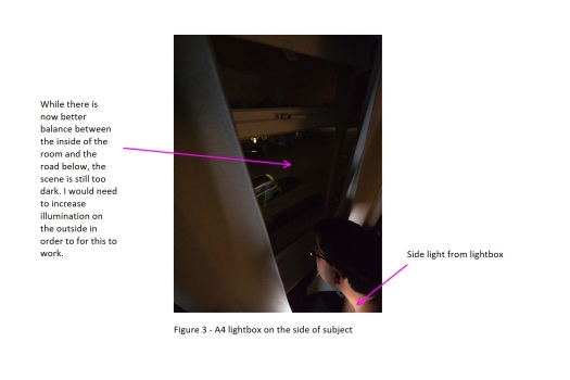
I also did some tests inside the car. The first attempts were made with a mobile phone, equipped with a 31mm equivalent lens. This gave a slightly more compressed view than what I was looking for, and did not allow much by way of context, but I felt that it provided an interesting basis to work with.Figure 4
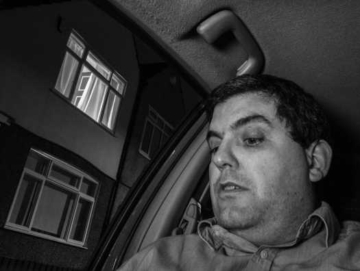
Following these proof of concept shots, I decided to concentrate on the picture from inside the car. The reason for this is that it allows me to show the face of the driver and to play with his expression in order to convey his anguish, as described at the end of the story. In the picture from the top room, the character would have to be shown in profile and this did not allow for any expressiveness, diminishing the impact of the image. I also was more pleased with how the elements balanced out in the car shot. The second test was performed with a 14-28mm equivalent zoom lens. I tried to place the camera in a similar place where I had my mobile, just behind the helm.Figure 5Following the second test, I decided to tackle the illumination problems in the two sets separately. The upper room set was illuminated using a large soft box on the right hand side, which would provide the main source of illumination, and a small LED box on the left hand side to provide fill light on the other side, complemented by a bed-side lamp with a warm lightbulb. Initially I also kept the main room light on, but this resulted in too much illumination for the upper room, compared with the light available inside the car, which made balancing the final exposure more difficult. In the end, I decided to turn this off and just leave the bedside table light on, together with the soft-box and LED box. The main lighting set-up for the upper room is shown below.Figure 6
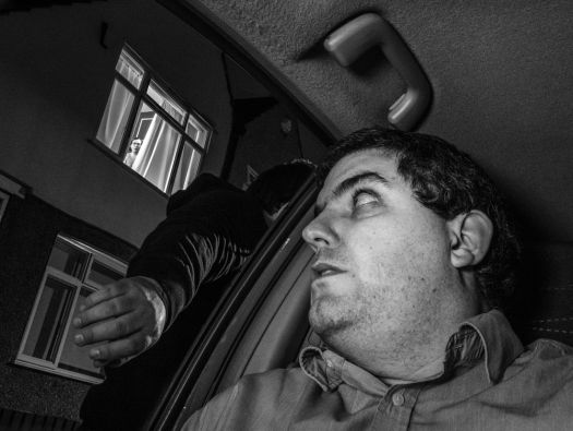
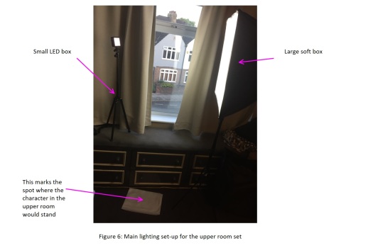
Inside the car, I had two main problems. The roof was too dark and the overall illumination of the subject was too poor. In the story, the character is playing with his phone while he waits for the recovery service. I decided it would be a good idea then to complement the ambient light by illumination from a phone, placed in front of the subject close to where the camera was set. The car has a cup holder next to the door and it would fit a mobile phone. It is conceivable that the driver would place his phone here while he takes a break from the Internet and watches the stranger that has captured his attention and has him worried for some time now (as per the storyline). This not only lifted the subject but also added some light to the roof of the car, which was primarily large black surface in the test pictures. In order to stabilize the camera in position, I crafted a narrow support plank with 5mm foam board, to which a flash bracket was fixed in order to be able to mount the camera and allow for some side adjustments for framing. The plank was resting on the main steering column on one side and on a tripod on the other. A pre-final test was taken to check for any final lighting problems and also to determine the final position of the characters:Figure 7For the final shot, I decided to try two alternatives to the mobile phone I used to illuminate the subject inside the car, as I still thought that the car and room illumination was too unbalanced. The first one was a small LED flash (two LEDs), but this source of illumination proved to be too strong and harsh on the subject. The second option was to use a tablet to illuminate the subject rather than a phone. In the end, the latter was the preferred option given that it provided a large, soft source of light and enabled a better balance between the two sets (as previously advised, I also reduced the light inside the second set in the upper room). Because this light essentially cancelled the slant shadow created by the external lamp-post, I experimented by adding a second led light on a stand just outside the car to complement the street light, but in the end decided not to use it for the final shot.Figure 8Figure 9Figure 10
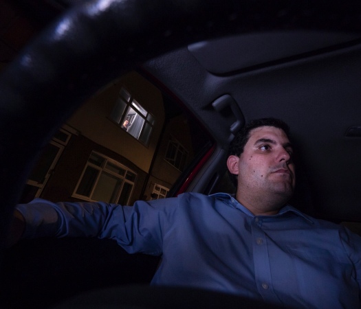
The final shot was taken with the characters dressed as intended. The man (myself) on the car was wearing a long, clear smart shirt, as if he was returning home from a long day at the office. I opted for clear tones here to aid with the illumination, as previous tests with darker casual clothing resulted in almost no highlights inside the car. The subject wore no glasses to avoid any distracting specular highlights. The character in the upper room (my partner) was told to look down towards the subject inside the car, who in turn is looking away, with a stern, concerned look. It is like if the characters were serially connected rather than making direct contact with each other, their anguish traveling from the upper room set, to the car, and then out of the frame.Technically, the final photograph, which is shown below, was taken as two separate exposures, one focused on the interior of the car and a second one focused on the window of the upper room. Both exposures where then combined in Photoshop. Distracting specular highlights and reflections on the house windows were cloned out or toned down in post processing. Other than this, most of the post processing adjustments where for colour balance, white / black points and shadow levels, with mild noise reduction applied. The picture was cropped to a 6×7 format to reduce negative space on the right hand side and to increase tension by having the main character looking out so close to the edge of the frame.